
Leather in Renders: Grain, Sheen and Where It Wears
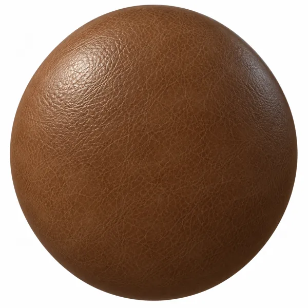
Leather is one of the easiest materials to recognise and one of the easiest to get subtly wrong. A leather texture that looks convincing on a flat swatch can turn an armchair into something closer to vinyl once it is wrapped around a real form, and the reasons are almost always the same three: grain scale, sheen and the absence of wear.
Grain first. Fine-grain leather has a pore and crease pattern measured in fractions of a millimetre; a pebbled or embossed grain is larger, and an exotic pattern such as crocodile is larger again, with scales that a viewer reads as individual shapes. When the texture repeat is set too large, fine grain turns into a blotchy, orange-peel surface; set too small, it disappears and the leather reads as smooth plastic. A useful check is the seam. A stitched seam on a sofa or chair has a known size, and the grain should look proportionate next to it. If the stitches look larger than the grain pattern suggests they should, the scale is off.
Sheen matters more than colour. Leather is defined by a soft, broad highlight that moves across the surface as the form curves, rather than the sharp reflection of lacquer or the flat response of fabric. That behaviour lives in the roughness map. A single uniform roughness value gives either a dull, matte hide or a wet, patent finish, and neither looks like upholstery. Real leather is slightly shinier on raised grain and slightly duller in the creases, and that small variation is what lets the highlight break up naturally across a cushion.
Wear is the part most renders leave out. Leather records use. Armrests, the front edge of a seat and the top of a backrest are handled constantly; they are smoother, a little glossier and often slightly lighter or darker than the rest of the piece. A chair with perfectly even leather from edge to edge reads as new at best and as a digital object at worst. Even a light, localised adjustment to roughness at the contact points changes the impression completely, and it is far more effective than adding scratches, which tend to look like damage rather than age.
Colour choice interacts with all of this. Dark chocolate and black leathers hide grain and rely almost entirely on sheen to show their form, so they need a light source that produces a visible highlight. Tan, taupe and olive leathers show grain and wear more readily and are more forgiving in soft, even lighting. Embossed patterns such as crocodile are best kept to smaller pieces or accents; across a whole sofa the repeat becomes obvious quickly.
Finally, direction. Leather is cut from a hide, and on a well-made piece the grain runs consistently across each panel. Rotating the texture to follow each cushion, rather than projecting it in one direction across the whole model, avoids the stretched, smeared grain that appears where a flat projection meets a curved edge.
Leather textures in the Laruus library, from fine grain to embossed crocodile, ship as full PBR map sets ready to apply to the upholstered furniture in the catalogue.
69
Related assets from the catalogue
Ready-to-render models and seamless textures covering what this article discusses.
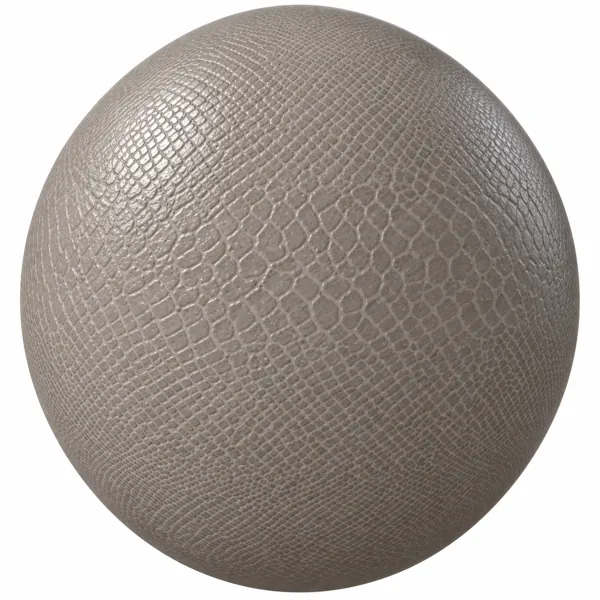
Warm Greige Reptile Grain Leather Texture
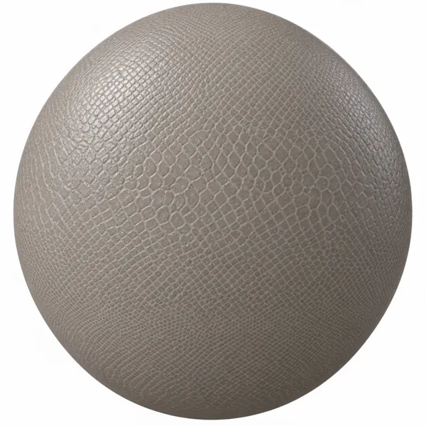
Warm Taupe Reptile Grain Leather Texture
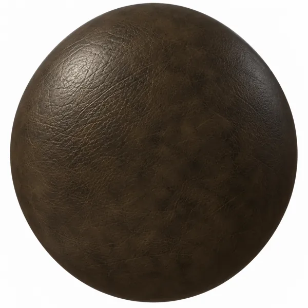
Dark Olive Brown Vintage Patina Leather Texture
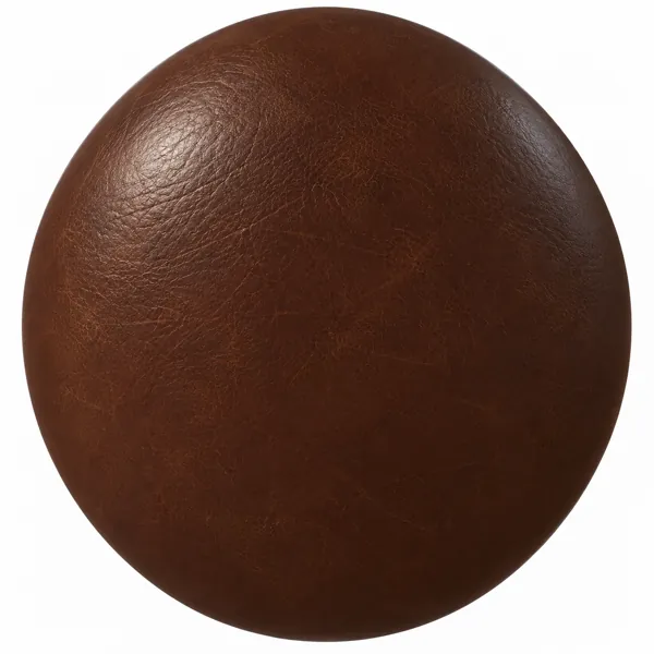
Dark Chestnut Aged Grain Leather Texture
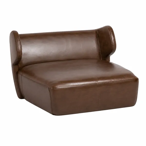
Brown Curved Leather Lounge Chair 3D Model
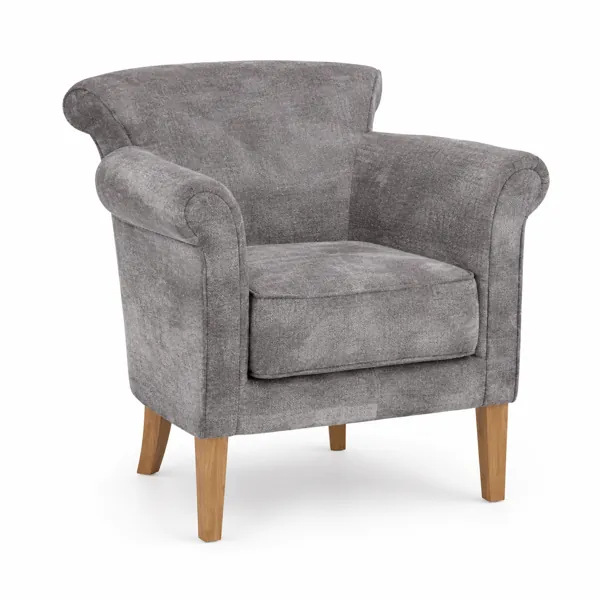
Light Gray Fabric Armchair with Wooden Legs 3D Model
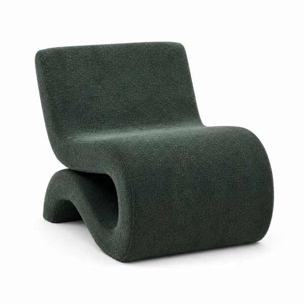
Dark Green Bouclé Sculptural Lounge Chair 3D Model
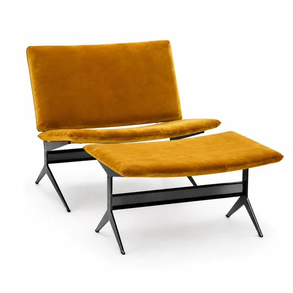
Modern Mustard Velvet Lounge Chair with Ottoman 3D Model