
Tile Scale and Grout: What Makes Ceramic Read as Ceramic
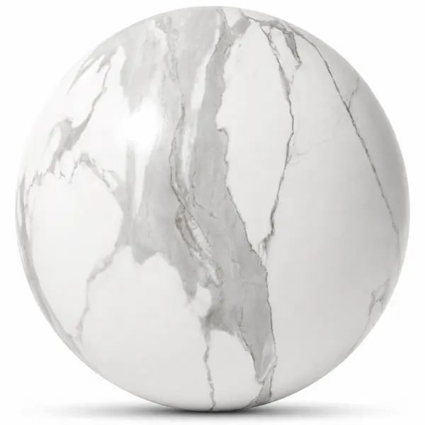
A ceramic surface in a render usually fails for one of two reasons, and neither of them is the texture itself. The tile is the wrong size, or there are no joints at all.
Tile size is a physical measurement, not a look. A wall tile is somewhere between a hand's width and a forearm's length; a large-format slab can run to most of a wall. Once the texture repeat drifts away from a real size, the room loses its sense of scale, and it does so in a way that is hard to trace back. The wall does not look wrong on its own — the whole room reads as either a doll's house or a warehouse, and lighting work will not fix it. The quickest check is to put a known object against the surface. A tap, a basin, a light switch. If the tile looks plausible next to it, the scale is close enough.
Joints are the second problem, and they matter more than they seem. Many ceramic textures are supplied as the tile face alone, which gives a continuous glazed plane with no grout lines. That is correct for a single large slab and wrong for anything laid in pieces. Where joints are needed and the map set does not include them, they are better added as geometry or as a separate overlay than painted into the albedo. A painted joint has no depth: it does not catch light from a raking source and it does not hold shadow, so at close range it reads as a printed line on a flat surface rather than a recess between two tiles.
Grout colour is worth a moment too. Matching grout to the tile makes a surface read as one continuous plane and quietens the wall; contrasting grout emphasises the grid and makes the tile size an explicit part of the design. Neither is wrong, but the choice changes how busy the surface looks, and on a large wall it changes it a lot.
Then there is the finish. Heavily glazed ceramics depend on reflection, which means they need something in the environment to reflect. A glossy tiled wall rendered in a bare room with no furniture and a plain light source has nothing to work with and goes flat and plastic. Matte and honed ceramics do not have this problem and are the safer choice in a sparse scene.
The roughness map carries most of the character here, more than the colour does. Ceramic is defined by how sharply it reflects, and a single uniform roughness value across the whole surface produces the mirror-flat look that immediately reads as computer generated. Real glaze varies — slightly, following the veining and the fired surface. Even a small amount of variation restores the sense that the tile came out of a kiln rather than a shader.
The metallic map is included in a full PBR set for completeness, and for ordinary ceramic it should stay at zero. It only means something for metallic-glazed variants.
Ceramic surfaces in the Laruus library ship as complete map sets, alongside the marble and concrete textures that usually share a wall with them.
134
Related assets from the catalogue
Ready-to-render models and seamless textures covering what this article discusses.
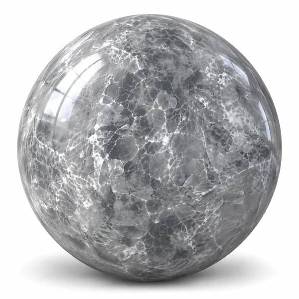
Smoky Grey Crystalline Web Veined Ceramic Texture
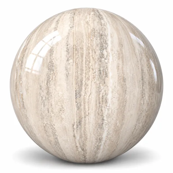
Warm Ivory Linear Travertine Effect Ceramic Texture
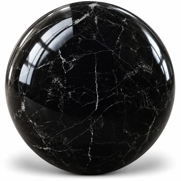
Deep Black Fine White Vein Marble Effect Ceramic Texture
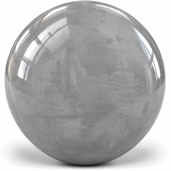
Soft Light Gray Concrete Look Ceramic Texture
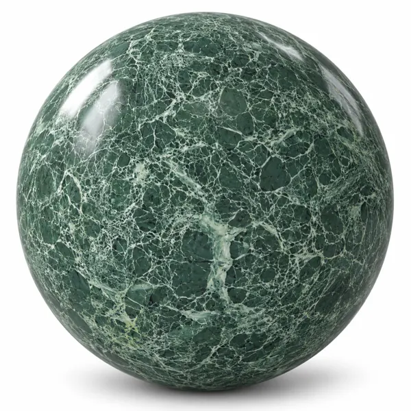
Deep Forest Green Web Vein Marble Texture
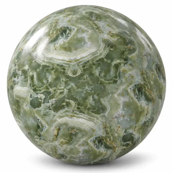
Sage Green Cloudy Banded Onyx Marble Texture
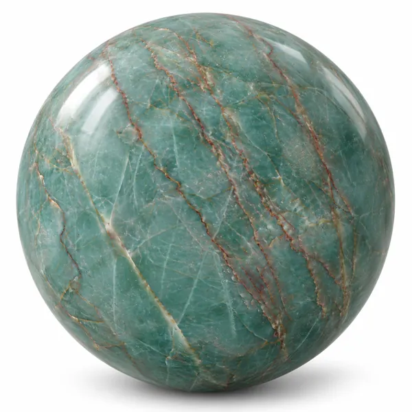
Turquoise Green Copper Vein Marble Texture
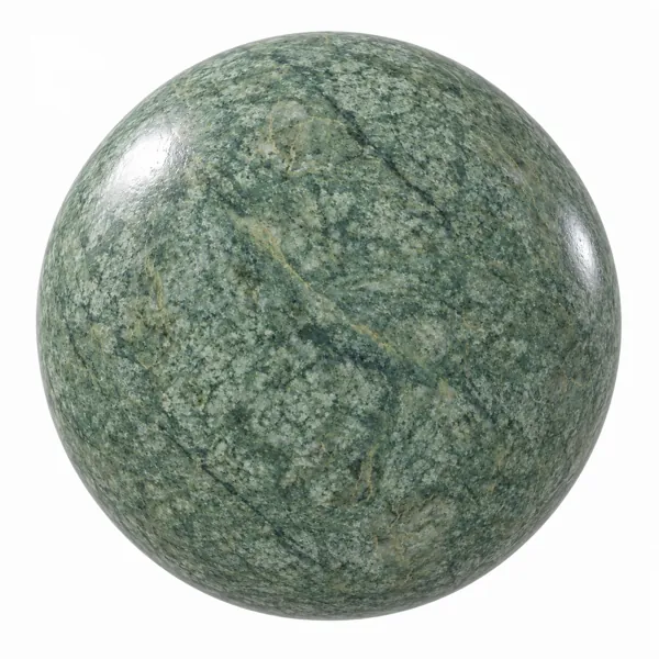
Soft Sage Green Fine Grain Marble Texture