
Choosing the Right Wood Texture for Architectural Renders
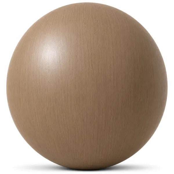
A wood texture can carry an entire interior render, or quietly ruin it. The material is rarely the problem — the way it is scaled, oriented and lit usually is. Here is how we think about wood when we produce textures for Laruus.
Start with the scale, not the colour
The most common mistake in archviz is a wood texture applied at the wrong real-world size. Oak floorboards are typically 120 to 190 mm wide and 1200 to 2200 mm long. If your tile is mapped so the boards read as 400 mm wide, the room will look like a doll's house even though every other detail is correct. Set your UV scale from real dimensions first, then judge the colour.
Grain direction is a lighting decision
Grain that runs along the length of a room stretches it visually and catches grazing light from windows. Grain running across the view breaks the space up and hides seams better in wide shots. Neither is more correct — but pick deliberately, because on a large floor this choice is more visible than the wood species itself.
Warm and cool oak are not interchangeable
Light oak covers a wide range in practice. A honey-toned oak with warm undertones will fight a cool north-facing daylight setup and turn slightly green in render. A neutral or ashy oak holds up much better under cool light, and warms up naturally under artificial lighting at 2700K. When a client says the floor "looks off" but cannot say why, this is usually the reason.
Roughness does more work than diffuse
Two renders using the same diffuse map can look completely different depending on the roughness map. Satin-finished wood sits around 0.35 to 0.5, a matte oiled floor closer to 0.6 to 0.75, and high-gloss lacquer below 0.2. Flat roughness values are the fastest way to make wood read as plastic. Variation across the boards is what sells it as a real surface.
Watch for repetition in large areas
Any tileable texture repeats. On a 40 square metre floor seen in a wide angle, the eye finds the pattern quickly. Rotating the mapping slightly, mixing two related textures, or breaking the surface with rugs and furniture all help. In practice, camera composition solves repetition more cheaply than a higher resolution map does.
Every wood and parquet texture in the Laruus library ships with the maps needed for a physically based setup, so you can adjust roughness and scale without rebuilding the material from scratch.
177
Related assets from the catalogue
Ready-to-render models and seamless textures covering what this article discusses.
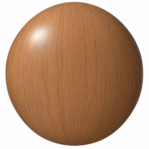
Warm Terracotta Brown Subtle Vertical Grain Wood Texture
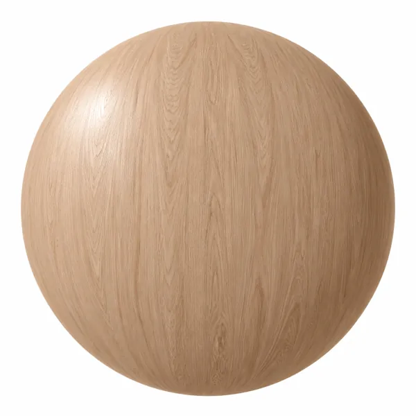
Warm Peach Beige Fine Grain Wood Texture
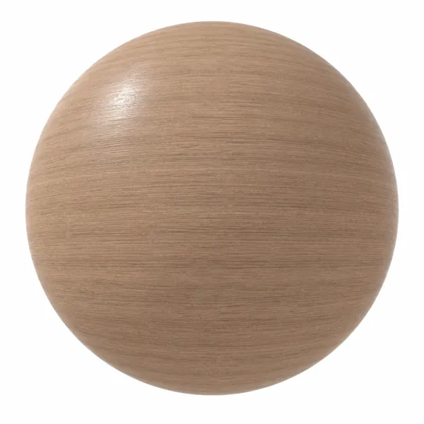
Light Taupe Fine Linear Grain Wood Texture
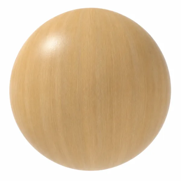
Light Golden Fine Linear Grain Wood Texture
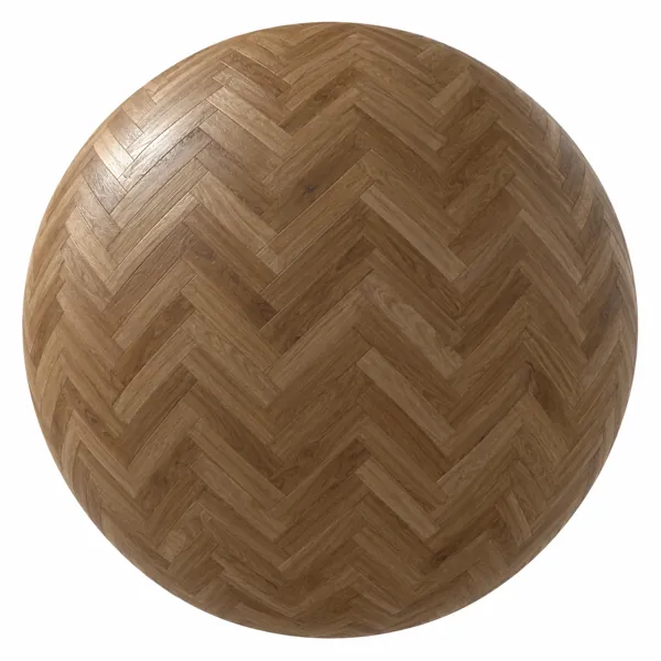
Warm Walnut Brown Herringbone Oak Parquet Texture
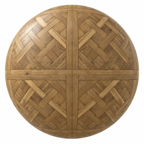
Warm Golden Basket Weave Oak Parquet Texture
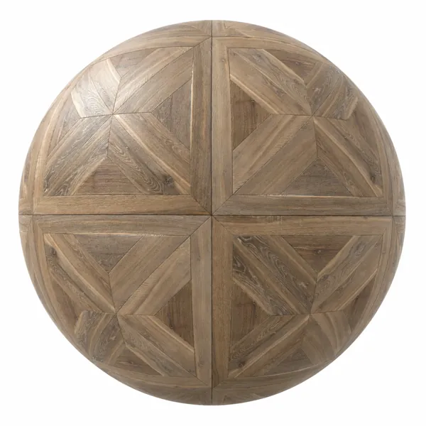
Weathered Geometric Oak Parquet Texture
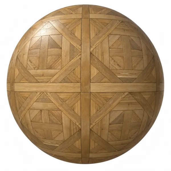
Golden Oak Geometric Panel Parquet Texture