
Parquet Textures
Free parquet flooring textures in plank and herringbone layouts, from pale sand and light blonde through to deep espresso, each with its own grain character: silvery linear, fine ribbon, subtle straight. Parquet covers a large uninterrupted plane in most interior renders, which makes grain scale and tonal consistency across the tile the things worth checking before committing to one. Supplied as complete PBR map sets.
100 texturesPBR mapsFree download
100 results
Free
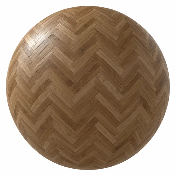
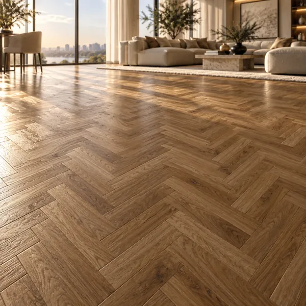
Warm Walnut Brown Herringbone Oak Parquet Texture
Laruus
Save
Wishlist
Free
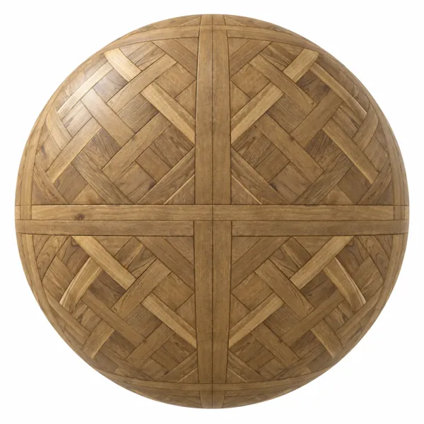
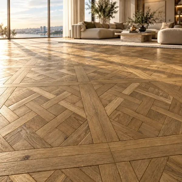
Warm Golden Basket Weave Oak Parquet Texture
Laruus
Save
Wishlist
Free
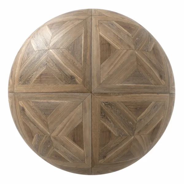
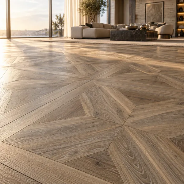
Weathered Geometric Oak Parquet Texture
Laruus
Save
Wishlist
Free
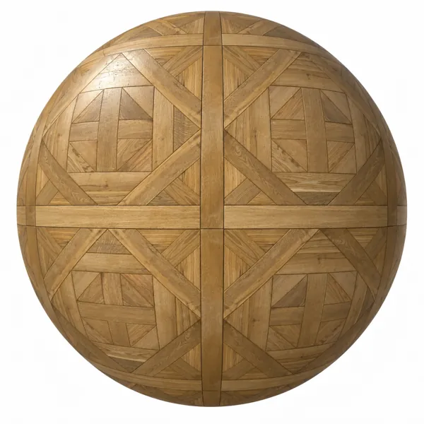
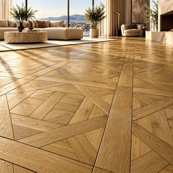
Golden Oak Geometric Panel Parquet Texture
Laruus
Save
Wishlist
Free
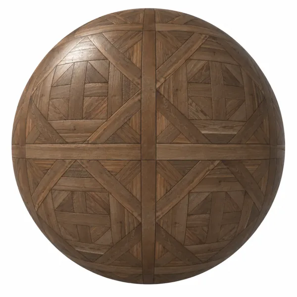
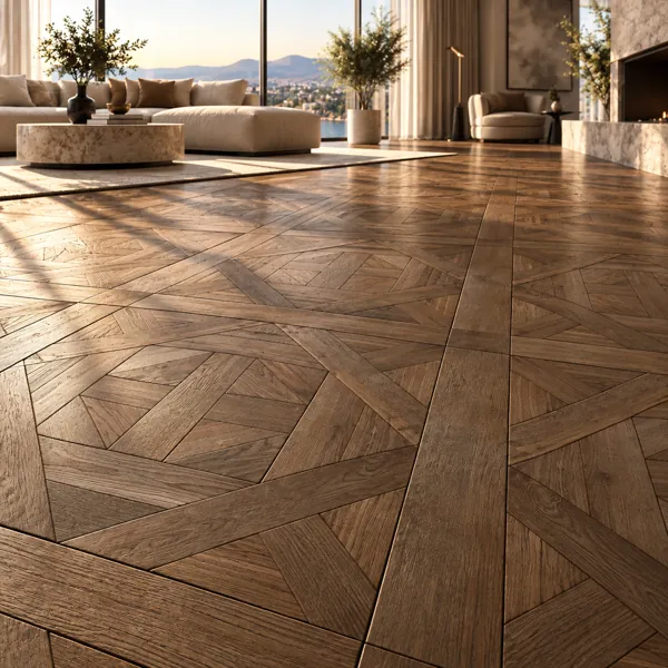
Warm Brown Geometric Panel Parquet Texture
Laruus
Save
Wishlist
Free
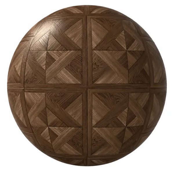
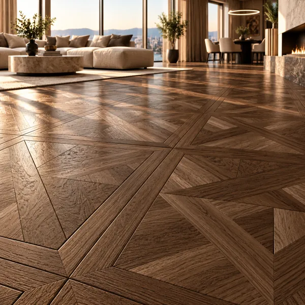
Warm Walnut Brown Framed Geometric Parquet Texture
Laruus
Save
Wishlist
Free
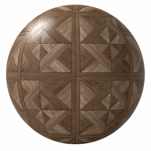
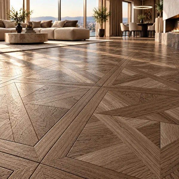
Warm Taupe Framed Geometric Parquet Texture
Laruus
Save
Wishlist
Free
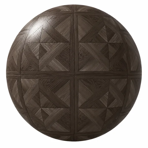
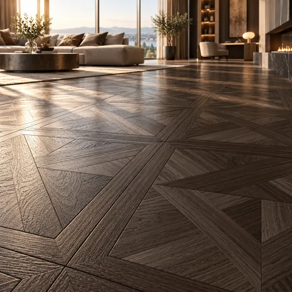
Dark Walnut Framed Geometric Parquet Texture
Laruus
Save
Wishlist
Free
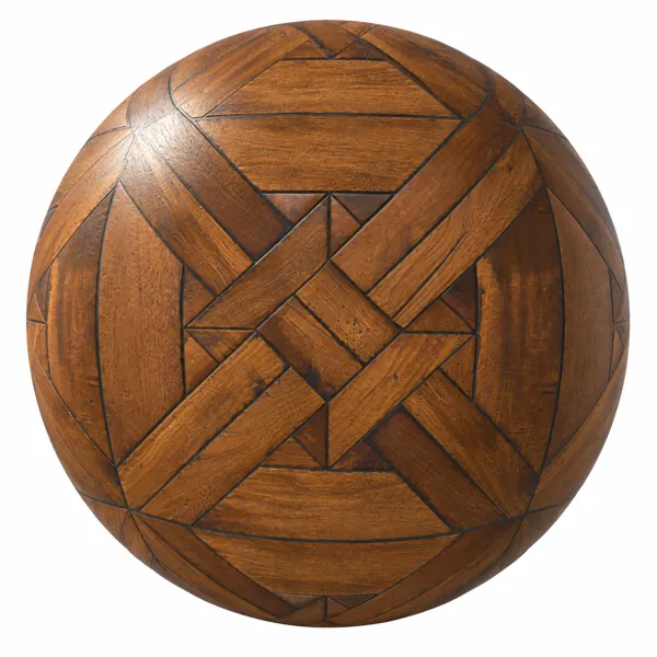
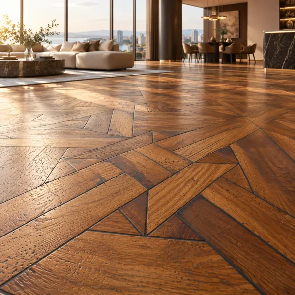
Warm Chestnut Geometric Inlay Parquet Texture
Laruus
Save
Wishlist
Free
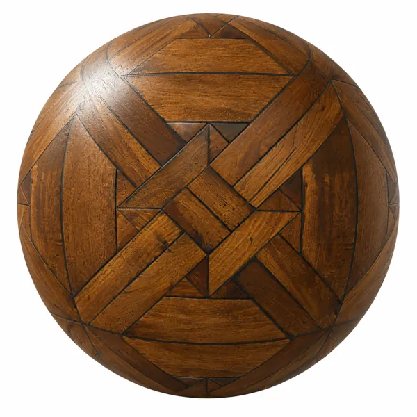
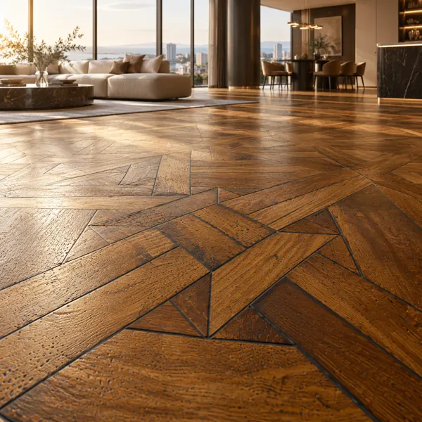
Warm Amber Geometric Oak Parquet Texture
Laruus
Save
Wishlist
Free
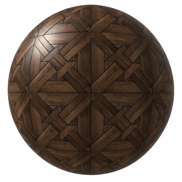
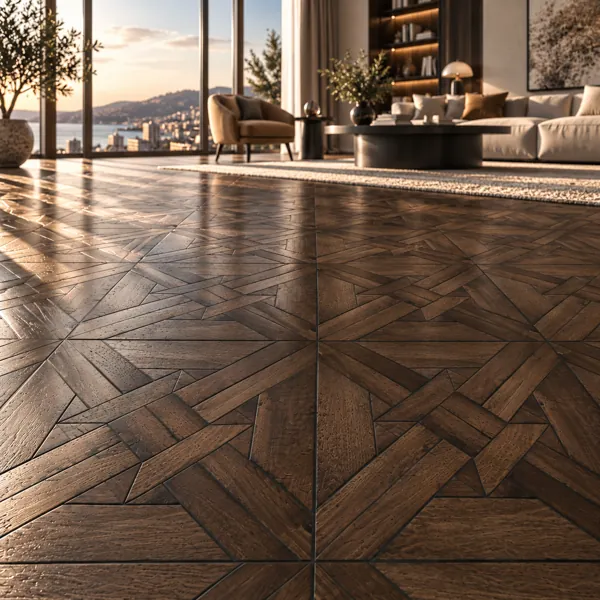
Dark Walnut Geometric Mosaic Parquet Texture
Laruus
Save
Wishlist
Free
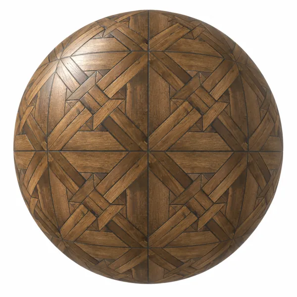
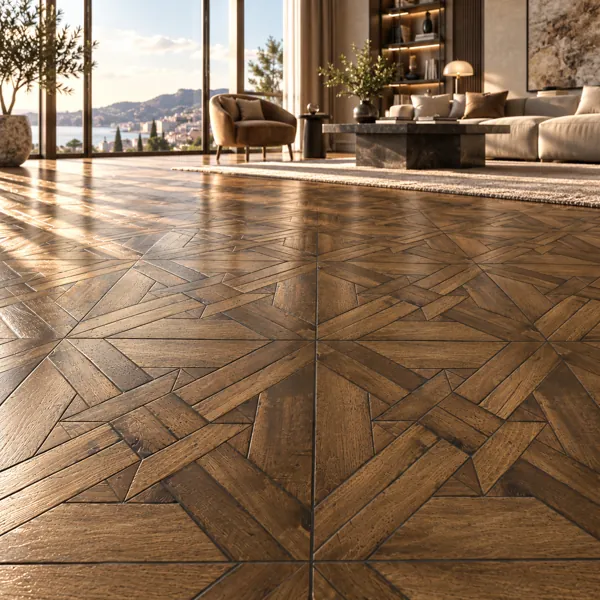
Warm Brown Interlocking Square Parquet Texture
Laruus
Save
Wishlist
Parquet Textures for Architectural Visualization
Parquet is the largest uninterrupted surface in most interior renders, which gives it an outsized effect on how the whole image reads — and makes its two failure modes unusually costly.
The first is scale. A plank has a real width, generally somewhere around a hand's span, and once the texture repeat drifts from that the room silhently loses its sense of proportion. Because the floor extends to the horizon in most interior compositions, a scale error here propagates through the entire frame in a way that the same error on a wall would not. Placing a chair leg on the floor and checking the plank width against it is a fast and reliable test.
The second is the visible tile repeat. Floors cover enough area that a texture tile may repeat many times within a single view, and the human eye is efficient at spotting periodic patterns — particularly a distinctive knot or a dark streak recurring on a regular grid. Rotating the UV a few degrees off the room axis helps, as does breaking the repeat with rugs and furniture placed where the pattern would otherwise be most obvious. On large open floors, mixing two closely related parquet textures across different areas is more effective than trying to hide a single repeat.
Layout is the third variable, and it is a design decision rather than a technical one. Straight plank runs are quiet and directional, and they read best when the run follows the length of the room. Herringbone and chevron carry considerably more visual energy and draw the eye downward, which is useful in a sparse room and counterproductive in a busy one. Herringbone also introduces a strong diagonal that will either agree or compete with the room's geometry, so it is worth deciding early.
Tones here run from pale sand and bleached oak through warm honey and mocha to deep espresso and blackened oak, with grain character varying from fine ribbon through silvery linear to broad cathedral figuring. Darker floors absorb light and will require more of it in the scene; pale floors bounce light upward and tend to flatter the rest of the room.
Full PBR map sets are supplied — diffuse colour, normal, roughness, metallic, height, ambient occlusion and edge, plus a packed variant. For wood surfaces that are not floor layouts, the general wood texture category covers grain rather than laying pattern.