
Plaster Walls Need Raking Light to Exist
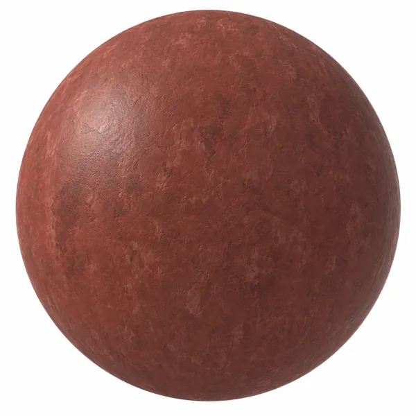
Plaster is the surface most often blamed on the texture when the real problem is the lighting.
A troweled plaster wall is defined almost entirely by relief. The trowel leaves shallow ridges and swirls, the surface holds slight undulation across its width, and edges pick up a soft sheen where the material was worked harder. None of that is colour information. It is all geometry at a very small scale, carried by the normal and height maps, and it only becomes visible when light crosses the surface at an angle. Lit straight on, a beautifully made plaster texture flattens into a single tone and looks like paint.
This is why plaster so often disappoints in a first render and why the fix is usually a light, not a map. If a plaster wall looks dead, before replacing the texture, try moving a light source so it grazes along the wall rather than facing it. In an interior that usually means a fixture close to the wall plane, a window throwing light along the surface rather than across the room, or a wash from a ceiling-level source. The difference is not subtle — the same texture goes from flat beige to something with hand-worked depth.
Scale runs the other way from most materials. Plaster detail is broad rather than fine: a trowel stroke is roughly the width of the tool, and swirls are read at arm's length rather than up close. A texture applied at too small a repeat turns the strokes into noise, which is why over-tiled plaster tends to look like sandpaper or stucco rather than a finished wall. If the wall is large, err towards a larger repeat than feels right.
Uniformity is the third issue. Real plaster is applied by a person over a span of hours, and it varies: slightly darker where it dried slower, lighter where the trowel pressed harder, and it rarely matches perfectly at a corner. A single tile repeated across a whole wall loses all of that, and the eye picks up the repetition quickly because trowel swirls are distinctive shapes. On a large surface, overlaying a broad, low-contrast tonal variation does more for believability than a higher-resolution base texture would.
Colour choice interacts with all of this. Warm terracotta and greige plasters carry more visible pigment variation and hide a repeat better; cool greys and near-whites are cleaner but show every seam and every uniform patch, so they need more care. Pale plaster also bounces a lot of light into the room, which is often the reason it was specified in the first place, and worth accounting for when the rest of the scene is lit.
Plaster sits naturally alongside concrete and stone in the same schemes, and the same lighting rule applies to all three: relief that nothing rakes across might as well not be modelled. Full PBR map sets for these surfaces are in the Laruus texture library.
130
Related assets from the catalogue
Ready-to-render models and seamless textures covering what this article discusses.
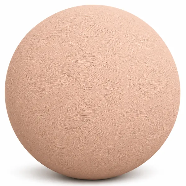
Soft Peach Arc Trowel Plaster Texture
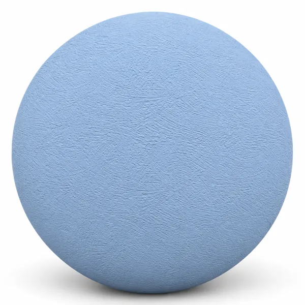
Powder Blue Arc Trowel Plaster Texture
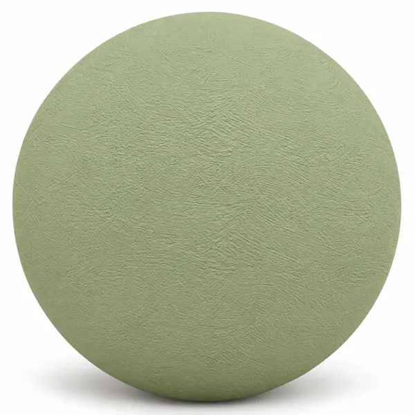
Soft Sage Green Arc Plaster Texture
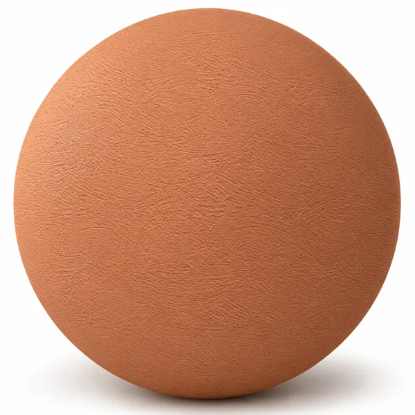
Warm Terracotta Orange Arc Plaster Texture
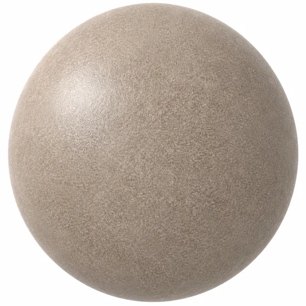
Warm Beige Fine Grain Mottled Concrete Texture
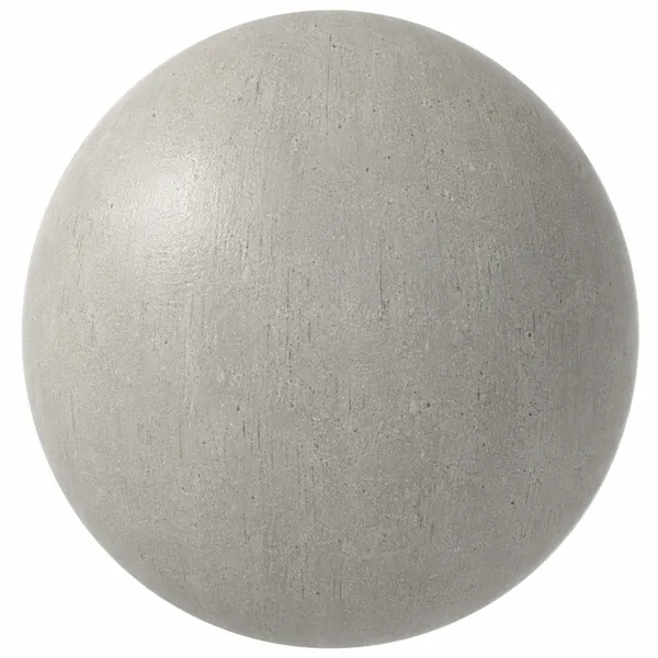
Warm Gray Vertical Grain Concrete Texture
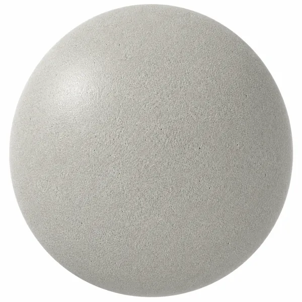
Pale Gray Fine Grain Concrete Texture
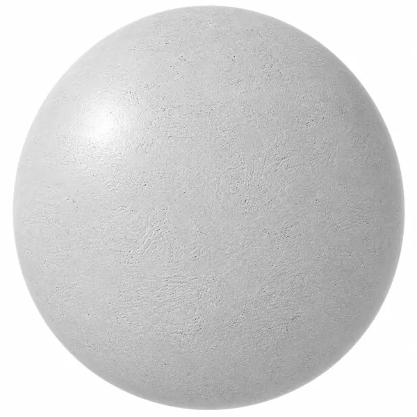
White Fine Pore Rough Concrete Texture