
Plaster Textures
Free plaster textures spanning warm ivory, cream and ochre through cool greys, terracotta and deep cocoa brown. Both ends of the range are covered: clean fine-grain and vertical-streak finishes for contemporary interiors, and heavily mottled, crackled and peeling surfaces for weathered walls. Complete PBR map sets.
100 texturesPBR mapsFree download
100 results
Free
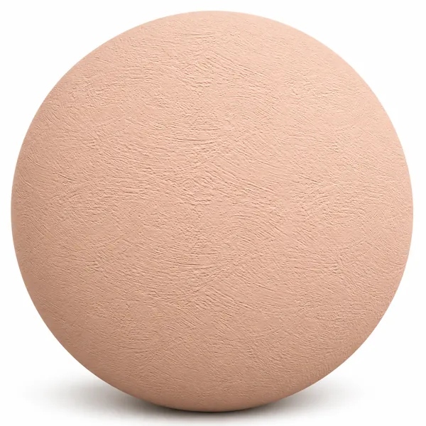
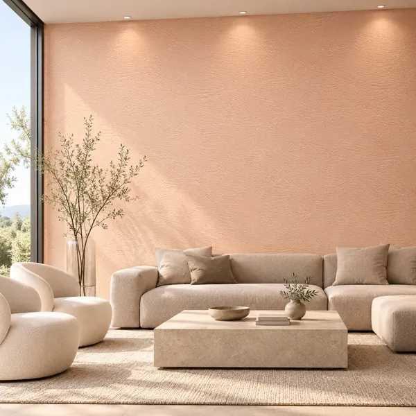
Soft Peach Arc Trowel Plaster Texture
Laruus
Save
Wishlist
Free
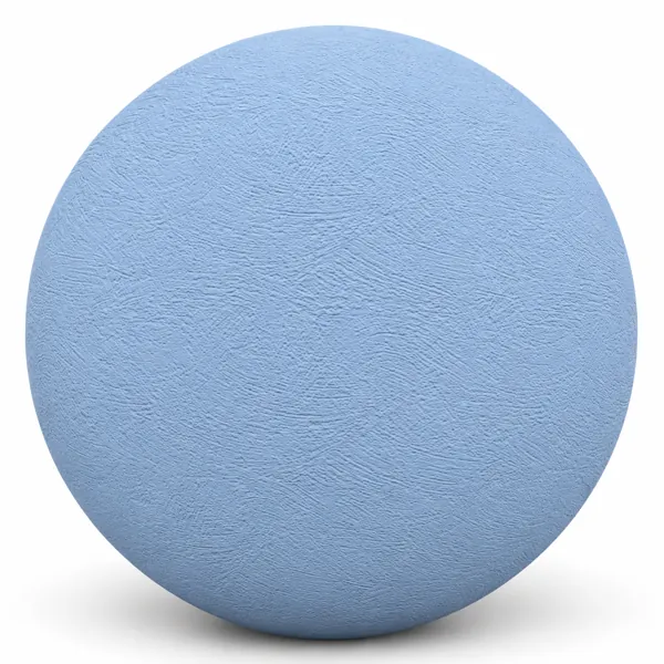
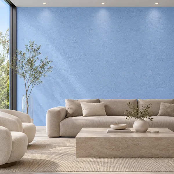
Powder Blue Arc Trowel Plaster Texture
Laruus
Save
Wishlist
Free
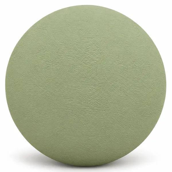
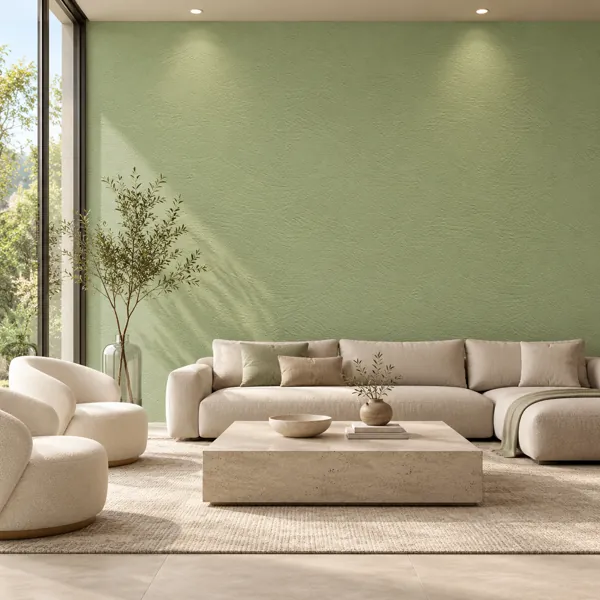
Soft Sage Green Arc Plaster Texture
Laruus
Save
Wishlist
Free
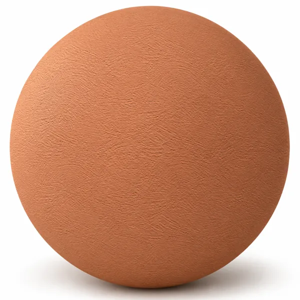
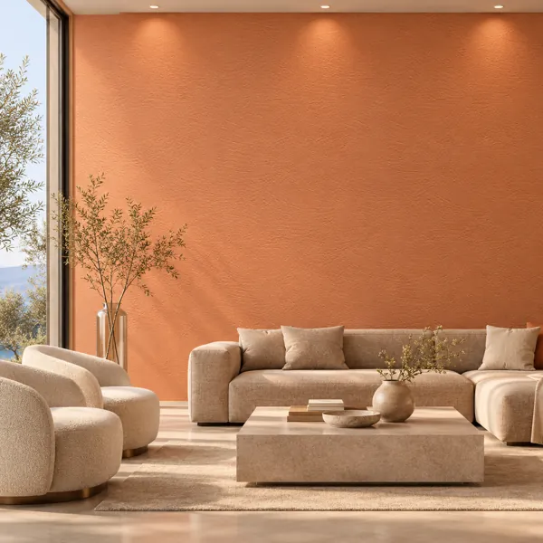
Warm Terracotta Orange Arc Plaster Texture
Laruus
Save
Wishlist
Free
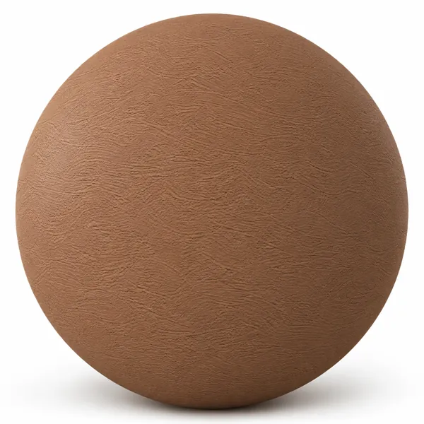
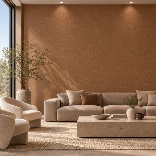
Warm Chestnut Brown Fine Arc Plaster Texture
Laruus
Save
Wishlist
Free
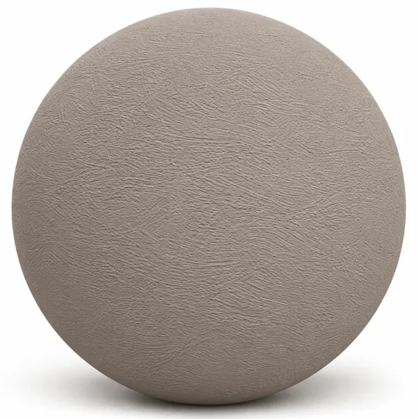
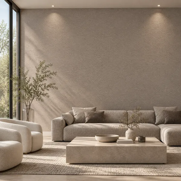
Warm Greige Fine Arc Plaster Texture
Laruus
Save
Wishlist
Free
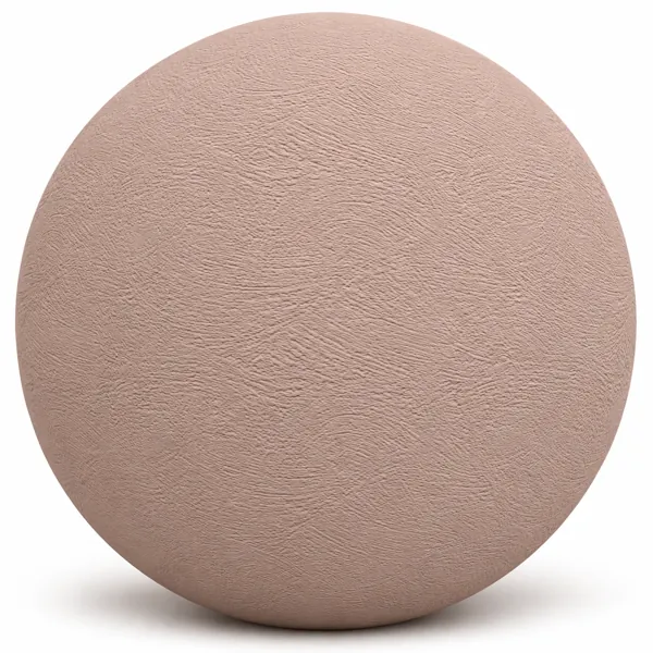
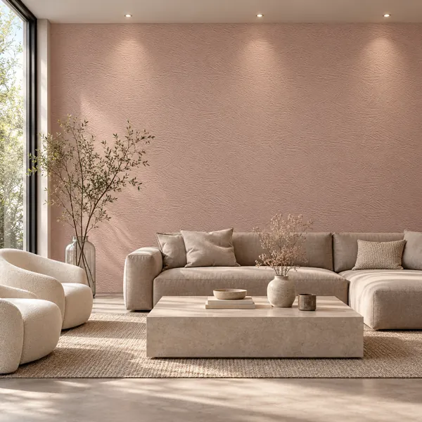
Dusty Rose Fine Swirl Plaster Texture
Laruus
Save
Wishlist
Free
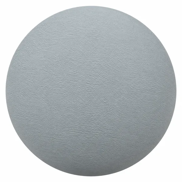
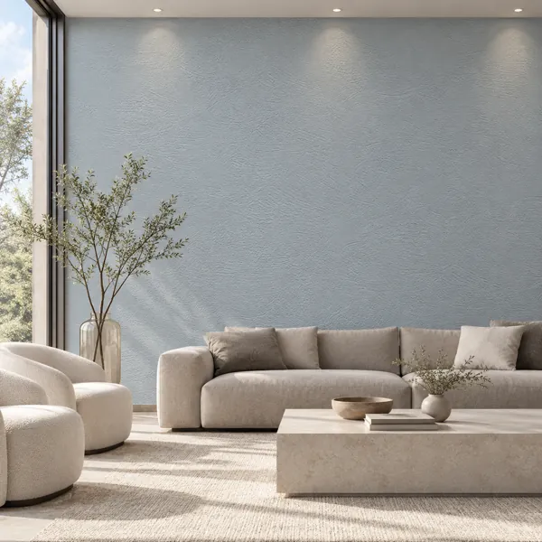
Cool Blue Gray Fine Swirl Plaster Texture
Laruus
Save
Wishlist
Free
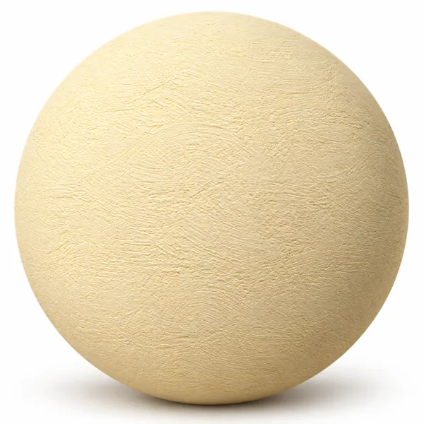
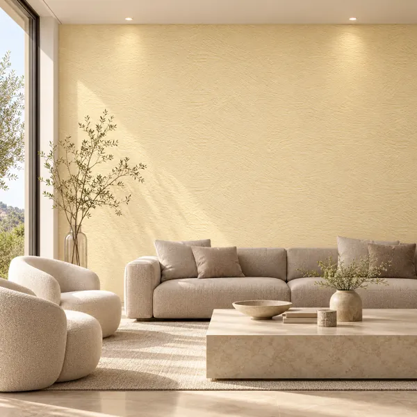
Warm Cream Yellow Fine Swirl Plaster Texture
Laruus
Save
Wishlist
Free
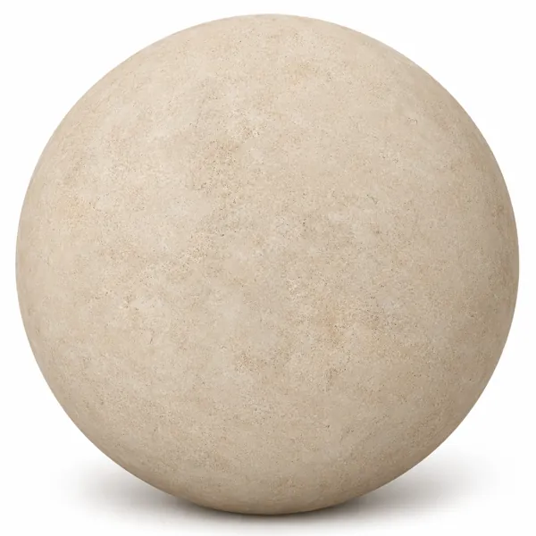
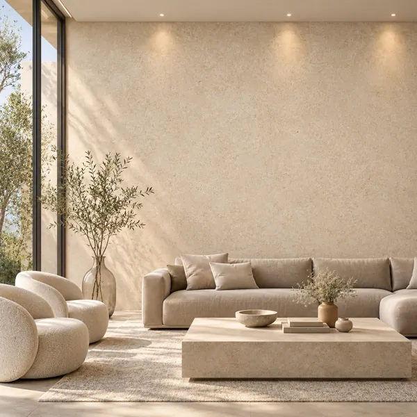
Warm Sand Beige Fine Grain Plaster Texture
Laruus
Save
Wishlist
Free
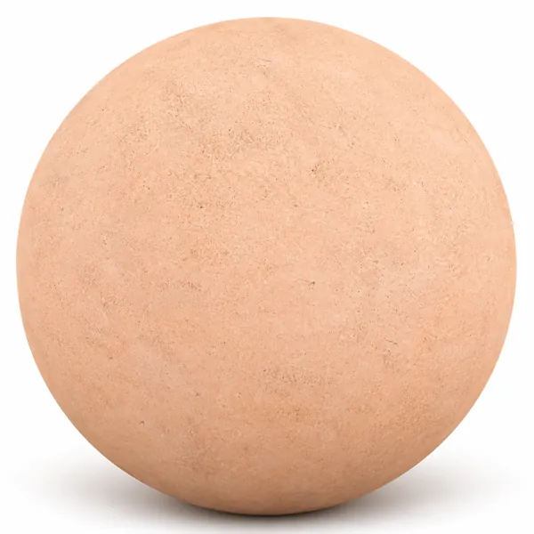
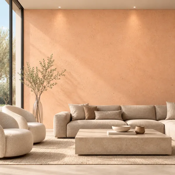
Warm Peach Coral Fine Grain Plaster Texture
Laruus
Save
Wishlist
Free
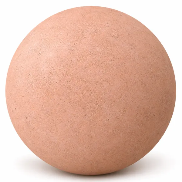
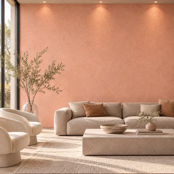
Soft Peach Pink Fine Grain Plaster Texture
Laruus
Save
Wishlist
Plaster Textures for Architectural Visualization
Plaster covers two quite different jobs in interior work, and the choice between them is made before any lighting decision. A clean fine-grain or lightly streaked finish behaves as a background: it holds a colour, carries just enough relief to avoid looking like paint, and lets furniture and joinery do the talking. A mottled, crackled or peeling surface is the opposite — it becomes the subject of the wall, and everything placed against it has to compete. Choosing the second when the scene needed the first is the most common reason a plaster wall feels busy without anyone being able to say why.
The weathered finishes carry a second obligation: they imply a history that the rest of the scene has to support. A wall with genuine peeling and patina sitting behind brand-new furniture and immaculate joinery reads as a texture applied to a wall rather than as an old room. Either the surrounding elements pick up some age, or the cleaner end of the range is the safer specification.
Colour temperature does more work here than in most material families. The warm side — ivory, cream, ochre, terracotta and sand — bounces a distinctly warm light back into the room, and in a small space it will tint everything, including skin tones and white joinery. The cool greys and taupes do the reverse and can leave an interior feeling flat when there is nothing warm elsewhere in the scheme. That is a lighting consequence rather than a swatch decision, and it is worth settling early, because it becomes expensive to reverse once the rest of the scene is balanced.
Relief carries the character, which means the normal and height maps matter more than the albedo does. A plaster surface lit flat-on loses almost everything those maps contain, so it is worth confirming that at least one source crosses the wall at an angle before judging whether a texture is working.
Tiling behaviour differs at each end of the range, and it should feed back into the choice. Fine-grain and lightly streaked finishes repeat almost invisibly, which makes them the practical option for a long uninterrupted wall. Crackle, peeling and heavy mottling carry shapes the eye matches quickly, so they hold up best on a shorter wall, a recessed panel, or a run already broken up by joinery.
These surfaces sit naturally with the concrete, stone and wood ranges in the same schemes.