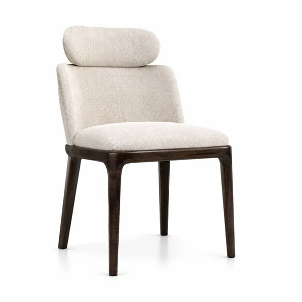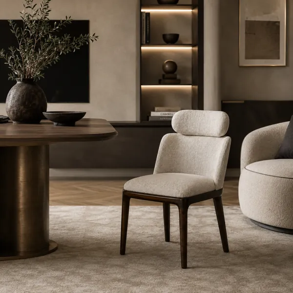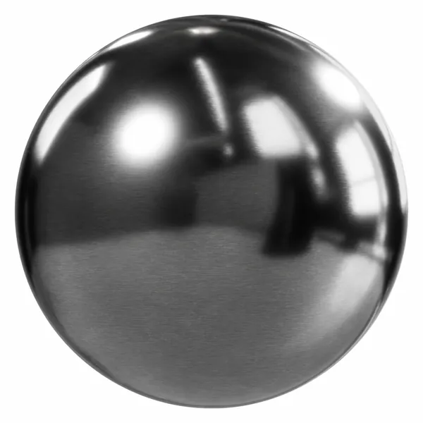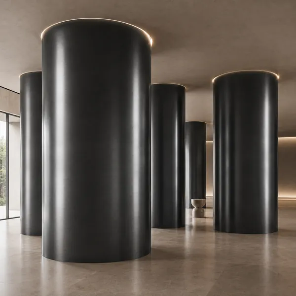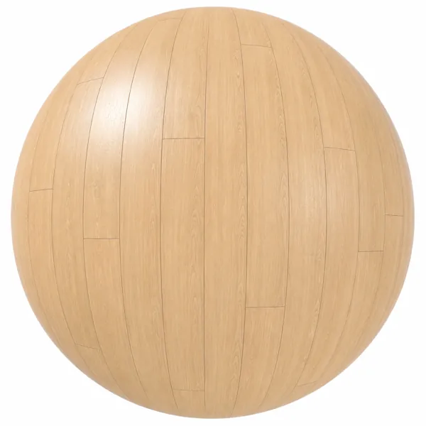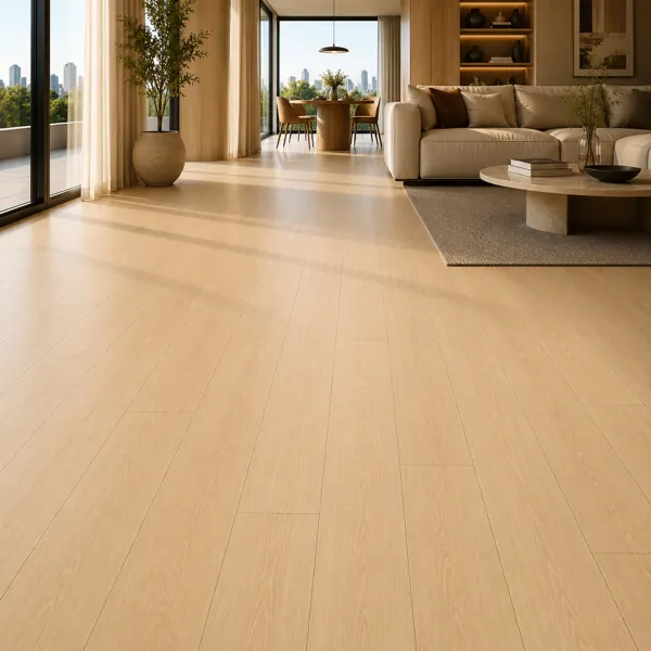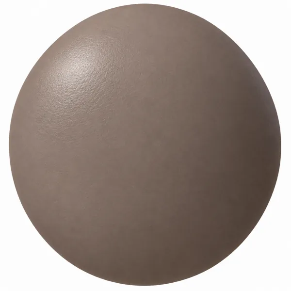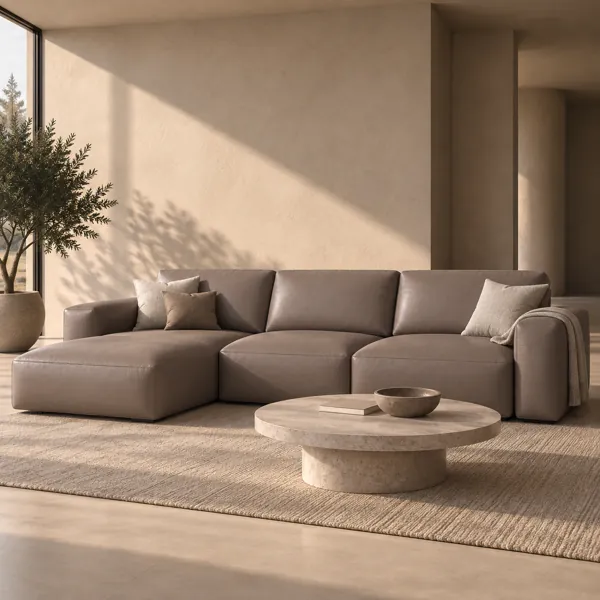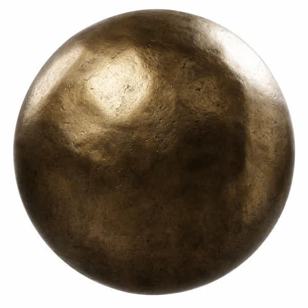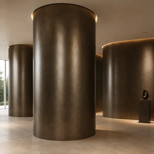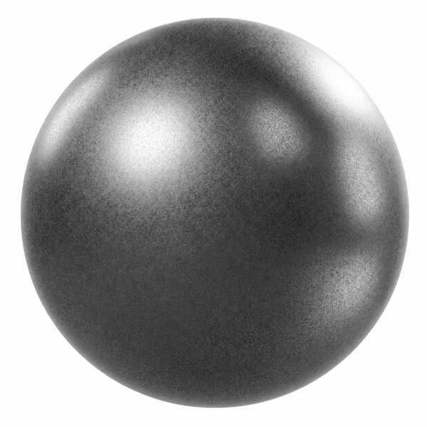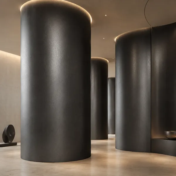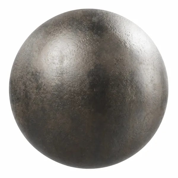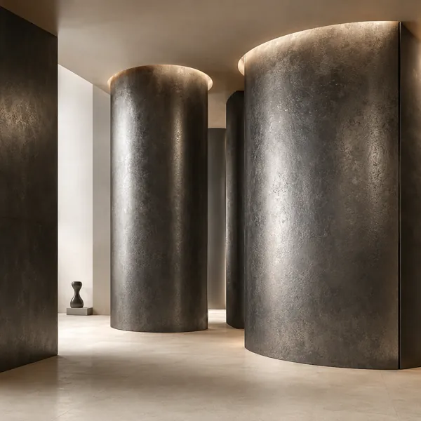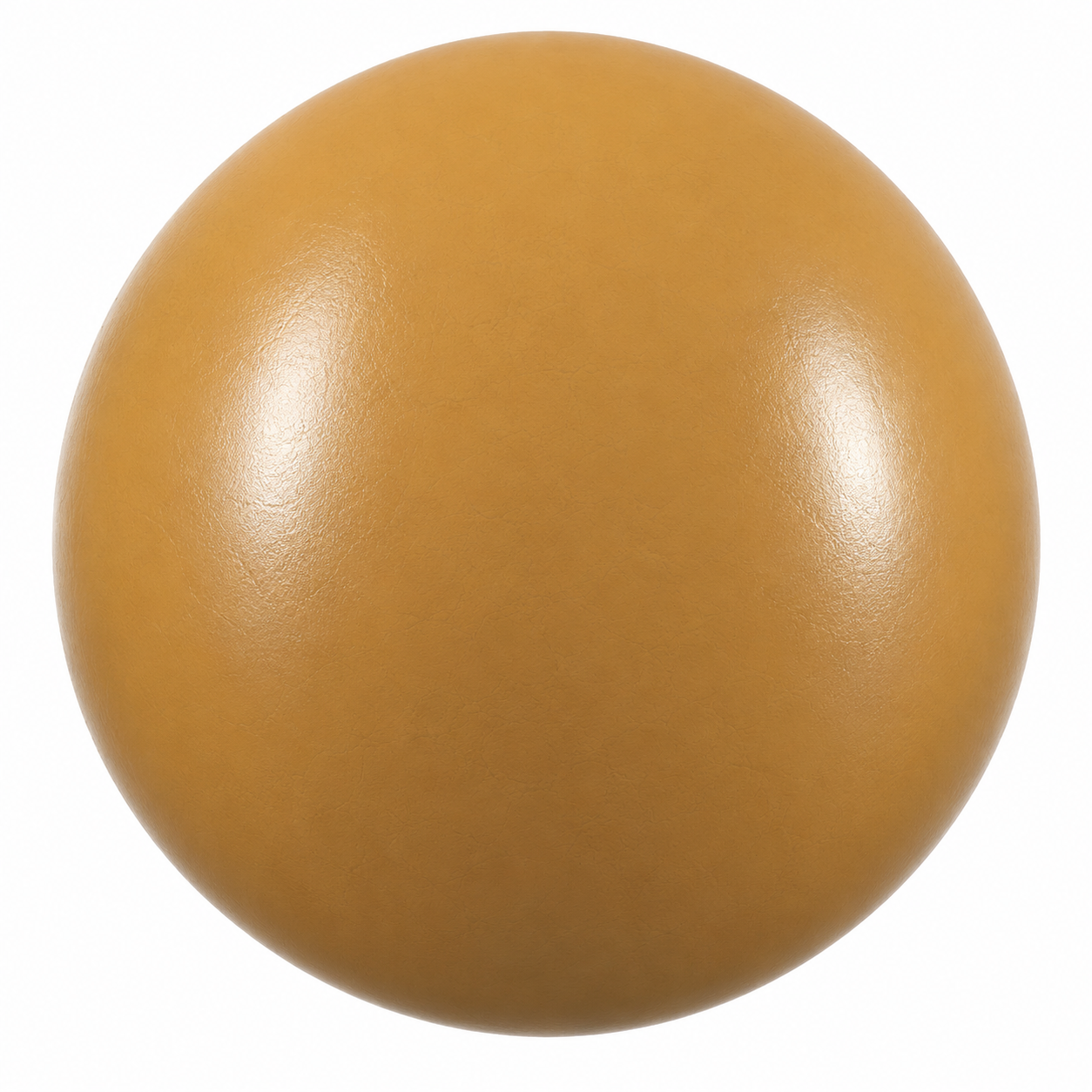
Warm Ochre Satin Painted Metal Texture
Metal No. 00007
FREE
Specifications
- Brand
- Laruus
- Style
- Modern
- Material
- Metal
- Suitable spaces
- Living Room, Bedroom, Office, Cafe, Commercial, Kitchen, Entrance
- Color
- YellowOrange
- File types
- Albedo MapAlpha MapAO MapBump MapDiffuse Color MapEdge MapEmission MapHeight MapMetallic MapNormal MapPacked Texture MapRoughness Map
Warm Ochre Satin Painted Metal Texture - High Resolution Seamless PBR Textures
Description
Warm Ochre Satin Painted Metal Texture features a distinctive golden ochre surface with restrained tonal variation and a softly reflective satin appearance. The visible finish is largely uniform from a distance, while closer inspection reveals delicate irregularities that prevent the surface from appearing perfectly flat or digitally sterile. Its combination of yellow-orange warmth, subtle mottling and controlled sheen gives the material a contemporary character suited to architectural surfaces, fabricated metal elements and decorative applications where a strong color identity is required without introducing an elaborate pattern.
The visual structure is based on a continuous metal surface rather than directional brushing, pronounced grain or repeating geometric details. Fine variations appear organically distributed across the finish, creating gentle shifts in tone while preserving an overall consistent ochre color. The preview indicates a relatively smooth macro surface accompanied by understated micro-detail, allowing reflections to remain broad and readable. Because there are no visually dominant seams, panels, scratches or directional lines in the presented material, it can work effectively across both compact objects and larger architectural elements without forcing a particular orientation on the design.
This warm painted metal texture can complement Living Room, Bedroom, Office, Cafe, Commercial, Kitchen and Entrance environments. It is particularly useful for feature panels, metal cabinetry, shelving details, decorative partitions, reception elements, display structures and contemporary architectural accents. The ochre finish can introduce warmth into interiors dominated by neutral stone, concrete, pale wood, dark metal or muted fabrics. Its saturated yet earthy appearance also makes it suitable for selected statement surfaces where designers want a recognizable color without relying on highly decorative ornamentation.
Within archviz and CGI workflows, the texture provides a useful foundation for creating believable painted metal materials on 3D geometry. It can be applied to flat surfaces as well as curved forms, provided that appropriate UV mapping and real-world texture scale are established for the specific model. The restrained surface variation helps maintain visual continuity across larger areas, while the satin character can respond clearly to studio lights, windows and architectural illumination. Artists can use the available texture maps to control surface response according to their chosen physically based rendering workflow rather than relying on a single color value.
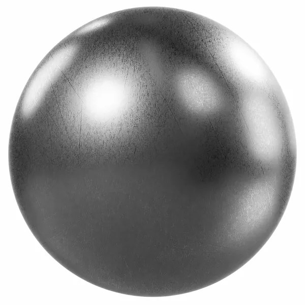
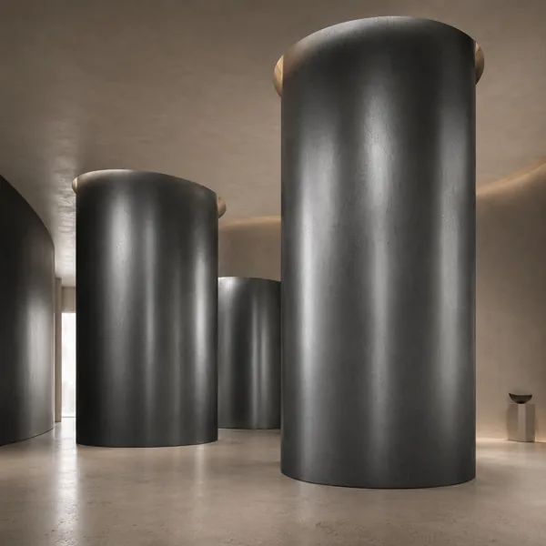
In interior visualization, the warm ochre tone works especially well as a contrast against cool greys, off-whites, charcoal finishes and natural neutral palettes. It can also coordinate with warm wood tones and subdued stone surfaces, making it useful for contemporary residential and commercial compositions. On large architectural features, carefully positioned area lights can reveal the gentle surface variation and reflective behavior; on smaller objects, softer illumination can retain the material's color while preventing highlights from overwhelming the painted finish.
The supplied set includes Albedo Map, Alpha Map, AO Map, Bump Map, Diffuse Color Map, Edge Map, Emission Map, Height Map, Metallic Map, Normal Map, Packed Texture Map and Roughness Map. These maps support flexible PBR material construction for archviz and general 3D rendering workflows. For the most natural result, keep the visible ochre coloration as the primary material identity and use reflection, roughness and relief controls with restraint. This approach preserves the fine surface character visible in the reference while allowing lighting and geometry to define realistic depth, highlights and material response.
Frequently asked questions
Is this texture free?
Yes. You can download it with a free Laruus account. Free textures are limited to 5 downloads per day.
Which software can I use this texture in?
The maps are standard image files, so they work in any renderer with PBR materials, such as Corona or V-Ray in 3ds Max, Blender, SketchUp with V-Ray or Enscape, and Unreal Engine.
What do I get when I download it?
A 16.0 MB download. It was added to Laruus on September 1, 2026.
Which spaces is it suitable for?
It suits Living Room, Bedroom, Office, Cafe, Commercial, Kitchen, and Entrance projects. Style: Modern.
Are there 3D models that use this material?
Yes. Laruus has 3D models in the same material:
- Metal — 275Browse Armchairs (26)